For this project, we chose to cover topics in photography with the book “No Caption Needed.” We focused on the introduction, chapter four and chapter nine. These chapters talked a lot about the iconic photograph of Raising the Flag at Iwo Jima. They also talked about iconic photography’s political power to unite a society under a simple common ideal that the photo is meant to convey. Continue reading
Breaking the Partnership: You’re Fired Edition
Wam Video Project from naveen raja on Vimeo.
For our video project, we decided to use the same script for two different situations. While the situations are related in that they involve the breaking of a partnership, the way each has been edited invokes different emotions in the viewer. We wanted to do this to show that the way something is edited, even with the same script, can change someone’s perception of what is happening as well as the mood.
Naveen and I’s video focuses on a female boss firing her male employee.
Emotion is a notoriously difficult thing to showcase by simply displaying an overview of the situation through film. We wanted to mock a montage feel in this video by offering various angles and clips of the scene to give differing perspectives. This way, the viewer is supposed to be able to identify with both the boss doing the firing and the disheartened employee. We are attempting to showcase the “invisible” as we talked about after reading Suhr and Willerslev’s “Can Film Show the Invisible?”
While the angry emotion of the fired employee is evident in the way Naveen reads the script, the way that the piece is edited highlights the severity of the situation. Cutting back and forth between characters gives the impression that there is more than just anger here. It lets the viewer know that emotions are as frantic as the edit.
The focus is not all on the fired employee. There is dread and that uneasy feeling of almost indescribable emotion on the part of the boss that has to do something she does not want to do. The audience can feel this nearly indescribable or “invisible” emotion as the shots are edited to shift quickly from employee to boss. The audience is meant to feel that something dramatic is about to happen.
The boss may end in a Ferris Bueller-esc manner talking straight to the camera for dramatic and almost comedic effect. However, this ending was edited so that the viewer gets to see both reactions to the firing. They see Naveen walk away and they see the boss’s feeble attempts to stop him as he walks in front of the camera facing the boss. This way, both emotions of the employee and boss should be evident to the viewer.
The setting also played a major role in our video. Without the office feel that we tried to create, our video would have lost some authority to be accepted as a business firing.
To keep with this official tone, we decided not to add in music in the editing process. If we had added music, the situation would have felt less organic. This way, the viewer is drawn more into the scene by the words, setting and editing alone. We wanted the emotion to be played out through the inflection of our voices alone and in the sharp edits that we made.
We began our video with a close up of a giant moose to try to set the scene of an office. We wanted to give a professional feel, so we also decided to dress the part in suits. To give our “studio” an office feel, we brought in a desk and laptops in a room filled with wooden interior.
We kept the “characters” separated for most of the video in order to edit the video in short clips back and forth between Naveen and me. As the conversation got more heated, the edits cuts between each of our faces became faster.
The way that the script is read in an official tone with anger apparent on the part of the employee does a lot to provide the “invisible” context to the story. However, the editing process also allowed us the change to make these emotions more apparent. The viewer is hence drawn deeper into the story that is meant to be taken seriously.
Remediating Star Wars Trailers: May the Force be with Me
This original Star Wars Episode IV trailer is made to attract a somewhat different audience than the Blue-Ray trailer release from a couple years ago. This trailer frames the plot as more of a love story within an adventure. Continue reading
“A World of Beauty” Rationale
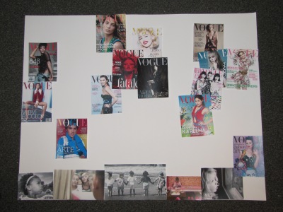
For my visual project, I wanted to connect what I had learned from our discussion on mapping with the Doreen Massey interview and Katharine Harmon readings to beauty/image issues.
Massey’s interview first shed light on how maps not only provide a reference for locations, but also provide various political and social connections between places across the globe. Thinking of maps as indicators of social issues and political power relations was something new. Continue reading
A World of Beauty
Graffiti and Colored Pencils
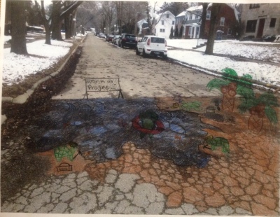
I chose the potholes on Ohio Street in Urbana to graffiti. I know that walls are the usual target for graffiti artists, but I thought these potholes could have a lot more to say. I wanted to make a commentary on the general state of roads in Chambana. Potholes are everywhere, but I manage to hit this particular strip daily. The crackled roads are a seemingly endless source of frustration for drivers. I wanted to graffiti them because as much as we complain about them, nothing is really being done to fix a majority of them. Someone should notice it, so what better way to get somebody to look than covering it with free “art.” Continue reading
Erasing Boarders with Wind Maps
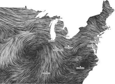
Rarely do you ever see the boarder of the Eastern US without each state perfectly bordered into all 50. It’s common to see all of those political boarders but once they are taken away, it presents so many questions to the viewer.
This is a wind map. It shows wind patterns along Eastern United States. It’s purpose may be to just show the winds. I am sure there are atmospheric elements here that go way over my head. But what I notice is the erasure of customary boarders. The patterns of the swirling winds and the lack of boarders leave almost nothing distinguishable from the next. Each state blends into one apparently when it comes to weather.
It’s a fact. Wind, and nature in general, knows no boundaries and yet seeing tho snap causes a viewer to pause. They are confused about which states lie underneath these winds. Various cities are singled out with bullet points in an effort to provide some perspective but to be honest can you really tell where the giant black blob or center of the wind swirls are located? Probably not.
Why then, do we always think of the entire world as a if it were on a grid, just begging to be bordered and explained in political boundary terms?
This map not only connects wind patters, bout it also connects the people and places that are under the winds. Someone in Chicago will experience similar winds to someone in Detroit and Indianapolis no matter what state he or she is separated into politically. In reality, the names of the cities don’t even matter, that it perhaps why not much care is taken to show the divisions between cities and states. They are only there to provide some perspective for those who can’t tell that the mitten in the center of the page is Michigan.
Depicting the Perfect Patriotic Women
The Women at Work in WWII posters are particularly interesting in their composition when you take a second to really consider the “beautiful” women plastered on all of these pages.
Most of the posters aim to invoke a sense of inherent patriotism in the women of World War II. They were made to influence the women of this time to “serve their country” by being a dutiful wife and supporting the war effort in a variety of ways. Continue reading
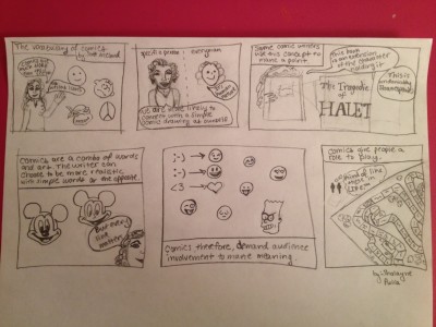
Scott McCloud’s “Vocabulary of Comics”
Texts in the Landscape of Downtown Portlandia
This sign may be simple, but it gives definite insight into the type of store it describes. There are no connected images, but the material that it is made of and the text font hints at certain criteria. Continue reading
